GMPT Identity Concept
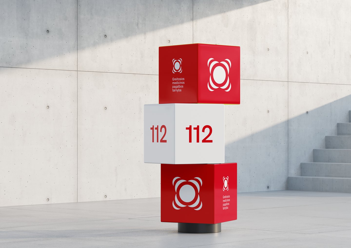
With the merger of all Lithuanian ambulance stations into one organisation, it was decided to create a new visual identity that would be modern and appealing to modern society.

The logo before.
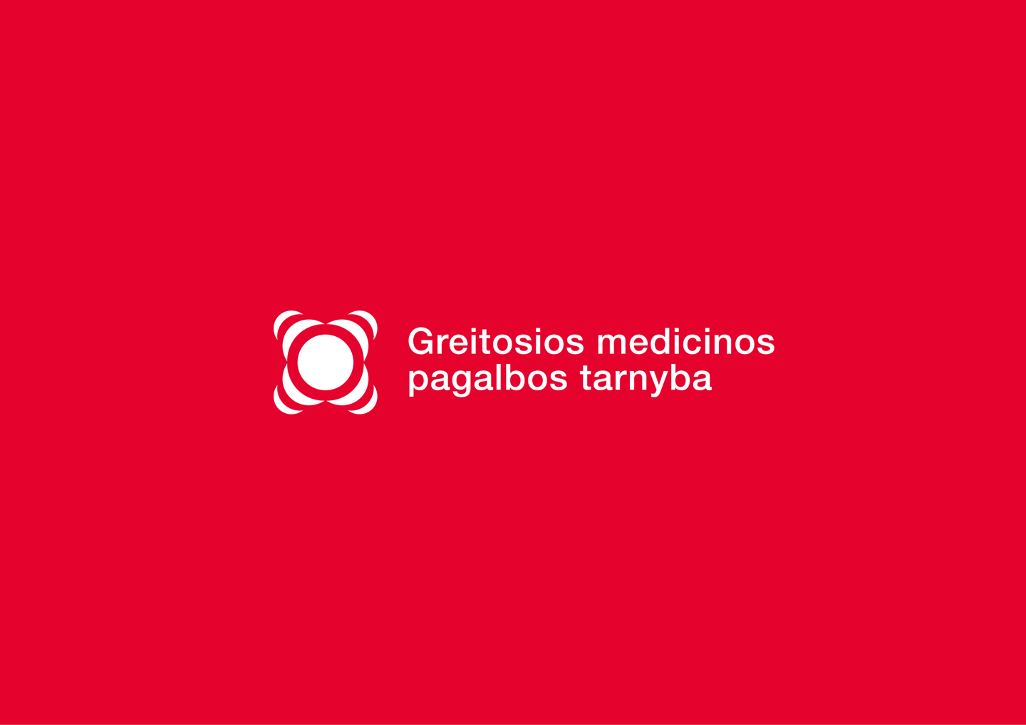
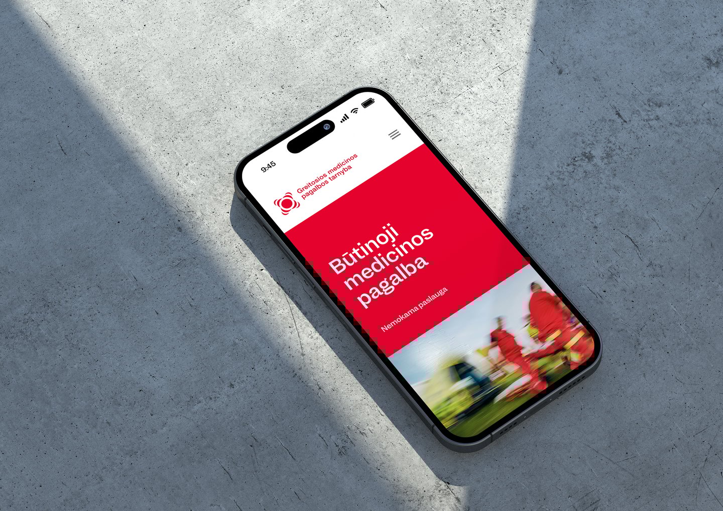
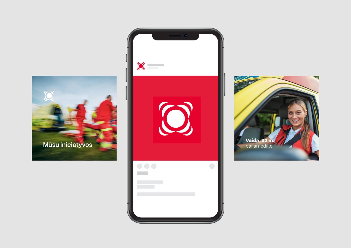
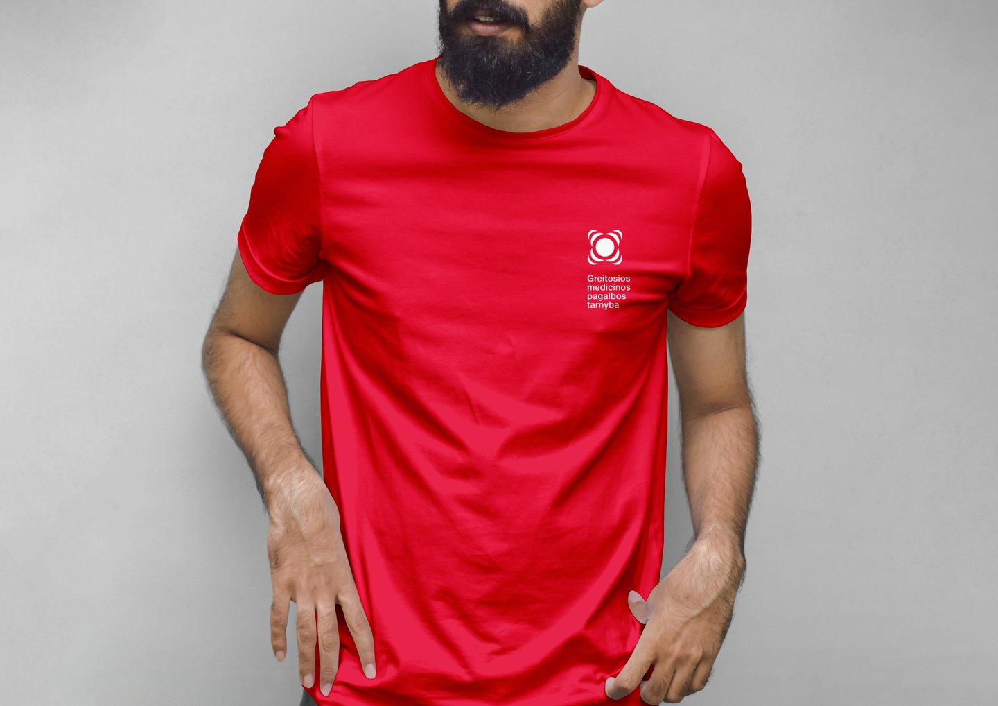
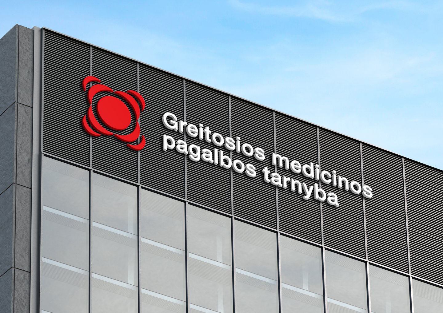
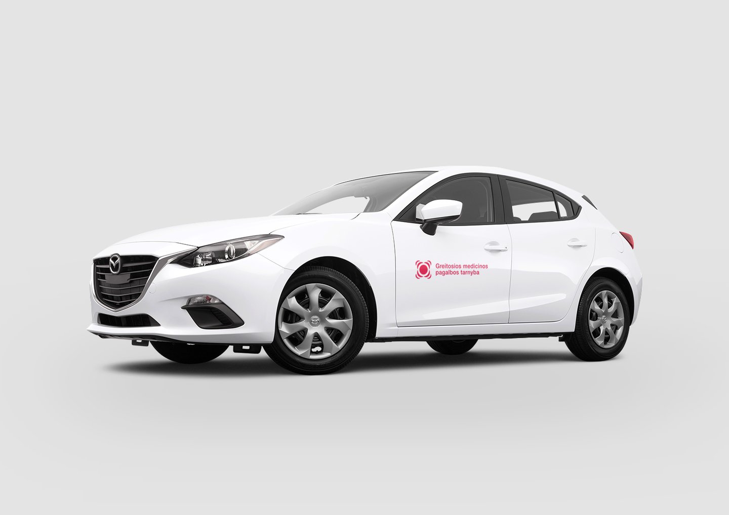
The main idea behind the proposed brand is to reflect GMPT's most important service standard - time. The external elements of the symbol open a dialogue with the consumer. They give the impression that the person is/will be heard and that the service will react promptly to the situation.
The composition of the symbol is based on a visual centre. This reinforces the image of a well-coordinated and efficiently managed company. The symmetrical arrangement of the graphic elements implies stability and reliability.
The sleek shapes contribute to a more friendly and open relationship. Red colour of the logo draws attention and is associated with life.
The proposed innovative identity is designed for the modern individual and his needs.